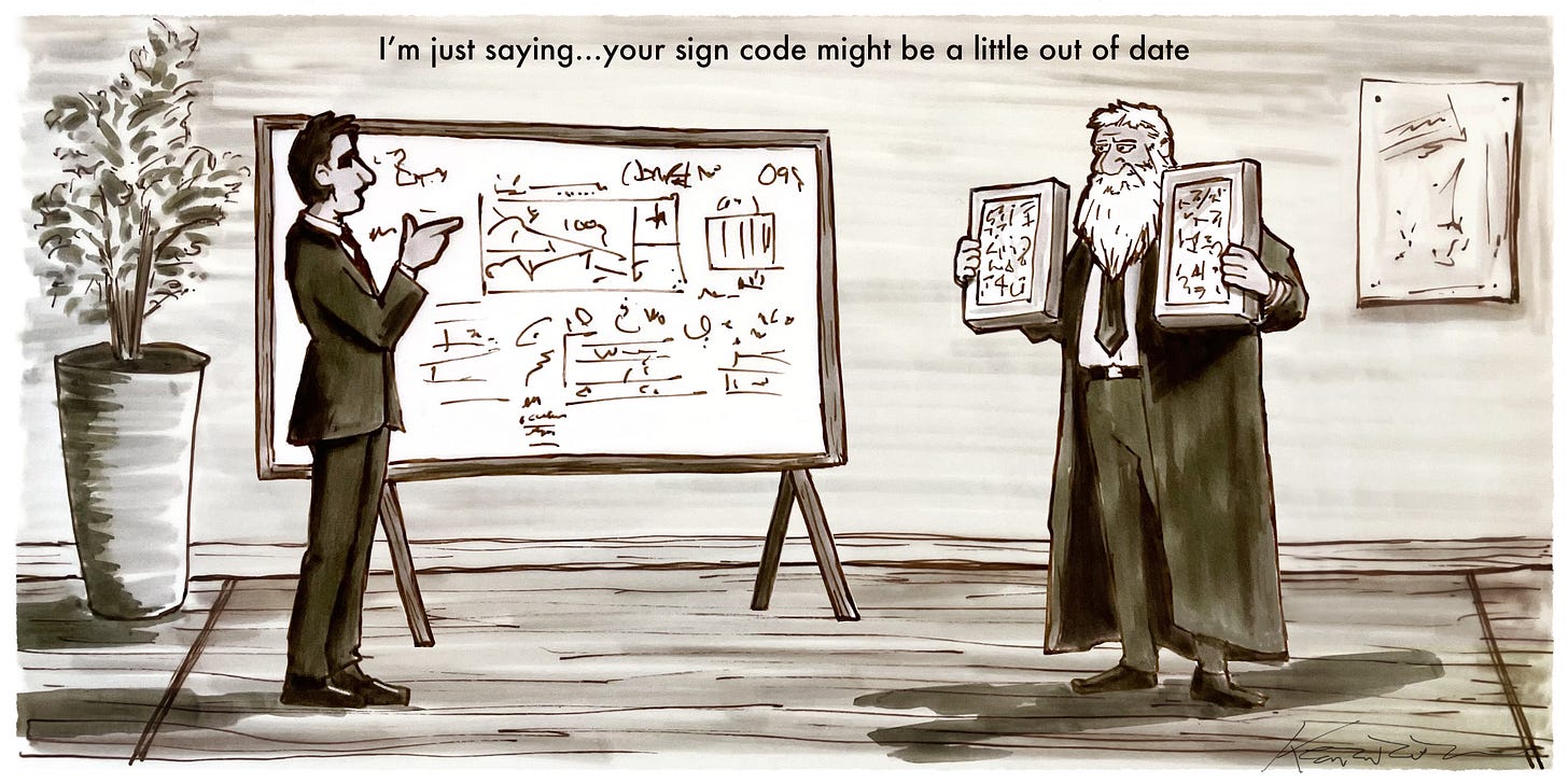
There’s a scene in Falling Down where Michael Douglas, stuck in the slow, grinding machinery of bureaucracy, just wants a breakfast sandwich. He’s seconds too late—cut off by an inflexible corporate policy—and the sheer absurdity of it pushes him over the edge. Now, I’m not saying township variance hearings are exactly like that, but if you’ve ever driven 2 hours to attend one on a Tuesday night, you know the feeling.
You walk in, armed with modern research on sign legibility—real data on how people actually read signs while driving—and the board looks back at you, bound by a sign code written in the 1950s when the biggest distraction on the road was the tail fin on a Cadillac. You just want your metaphorical breakfast sandwich: a sign that’s visible, effective, and safe. But the code says no, because somewhere, decades ago, someone decided that all signs should be 4 square feet…and beige.
The Well-Meaning Catch-22
Here’s the thing: the people sitting on township boards aren’t villains. They’re community members who genuinely want to do what’s best. But they’re also working with outdated ordinances that haven’t kept pace with modern traffic speeds, digital signage, or even the basic science of legibility. And that’s how you ended up in a hearing: trying to explain that no, your sign isn’t too big—it’s actually the correct size based on decades of research about how fast-moving drivers process information.
This is where advocacy comes in. You don’t win these battles by flipping tables (Falling Down isn’t a blueprint, after all). You win by coming prepared with the right information.
The Science Behind Better Signs
When you’re behind the wheel, your brain doesn’t process signs the same way it would if you were standing still. You have only a few seconds to:
Detect the sign (Does it stand out from the background?)
Read the message (How big are the letters? How simple is the wording?)
React (Do you have enough time to make a safe lane change or turn?)
A well-designed sign considers all of these factors. The faster the speed limit, the bigger the letters need to be. The more complex the driving environment, the simpler the sign’s message must be.
The problem for townships? Many township codes weren’t written with any of this in mind. That’s why so many communities still have outdated restrictions that limit readability rather than enhance it.
The problem for designers? The 30 years worth of publicly available research on this topic often goes unnoticed because let’s face it…its technical and boring.
I can honestly say though, every time I have walked into a variance hearing armed with this information, I have gotten the approval I am looking for.
A Tool for Change
This is a project I have pushed for over 10 years, taking this information and making it easier to comprehend and use. This research manual is not just a guide—it’s an advocacy tool. It gives business owners, designers, and city planners the hard data they need to make the case for better, safer, more effective signage. It helps township boards understand that updating sign codes isn’t about making towns look like Vegas—it’s about making sure people can actually read the signs in time to make safe decisions.
There’s math behind it (don’t worry, we won’t make you solve equations), but the bottom line is this: for a sign to be effective, it needs to be designed for the way people actually see and react on the road.
At the end of the day, we all just want to get where we’re going—without missing our turn, squinting at a microscopic font, or, heaven forbid, ending up in our own Falling Down moment.
My co-author, Mark Jenkinson and I are very proud of this work with the Sign Research Foundation, and I am happy to answer any general questions about the publication in the chat or DM.
If you want to arm yourself with research-backed standards that help make the case for better, clearer, and more effective signage. It can be purchased at the link below:


